Introduction: Why Wine Product Pages Matter
On a wine website, the product details page is where interest turns into action. It is the point where a visitor decides to buy, send an inquiry, save the wine for later, or leave the site altogether.
That makes the PDP one of the most important pages on any wine website, whether the site is built for direct ecommerce or catalog-style product discovery. Unlike many generic ecommerce product pages, wine PDPs need to do more than confirm the basics. They need to support both quick purchasing and deeper exploration. Many wine buyers want a combination of story and technical detail, and they expect the page to make both easy to access.
This also remains a real UX opportunity. According to Baymard’s 2025 ecommerce product page UX benchmark, only 49% of leading ecommerce sites delivered a decent or good product page user experience. That said, there is still room for improvement.
A well-designed wine PDP should help users understand what the wine is, why it is worth considering, and how to purchase it without friction. This article breaks that down into content, layout, functionality, and practical strategy.
The Essential Content Every Wine Product Page Needs
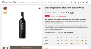
The first job of a wine PDP is to answer basic product questions clearly and quickly. Visitors should not have to search for essential details.
At minimum, most wine product pages should include:
- wine name and producer
- vintage
- region or appellation
- grape varieties
- bottle size
- alcohol percentage
- tasting notes
- food pairing suggestions
- production or aging details
- availability and purchase format
- flavor profiles
For many wine buyers, this information is the foundation of trust. The page should also support more advanced evaluation, especially for enthusiasts, sommeliers, retailers, and distributors. That is where technical details, vineyard information, downloadable tech sheets, and awards or ratings become useful.
Supporting content adds another layer of value. A short producer story or winery background can help differentiate the product, especially when the wine is unfamiliar to the customer.
The main UX challenge is balance. Casual buyers may want an approachable description and serving suggestion. More experienced buyers may want production method, terroir detail, and aging information. The best wine PDPs support both without becoming cluttered.
That balance matters commercially as well. In the Salsify 2024 Consumer Research report, 78% of shoppers said product images and descriptions were very or extremely important in deciding whether to complete a purchase, while 72% said the same of ratings and reviews. Strong product content directly supports conversion.

Structuring the Page: Layout and Element Placement
Users do not read product pages in a linear way. They scan for cues, especially in the first few seconds. That makes layout critical.
A structure that works well for wine product pages usually looks like this:
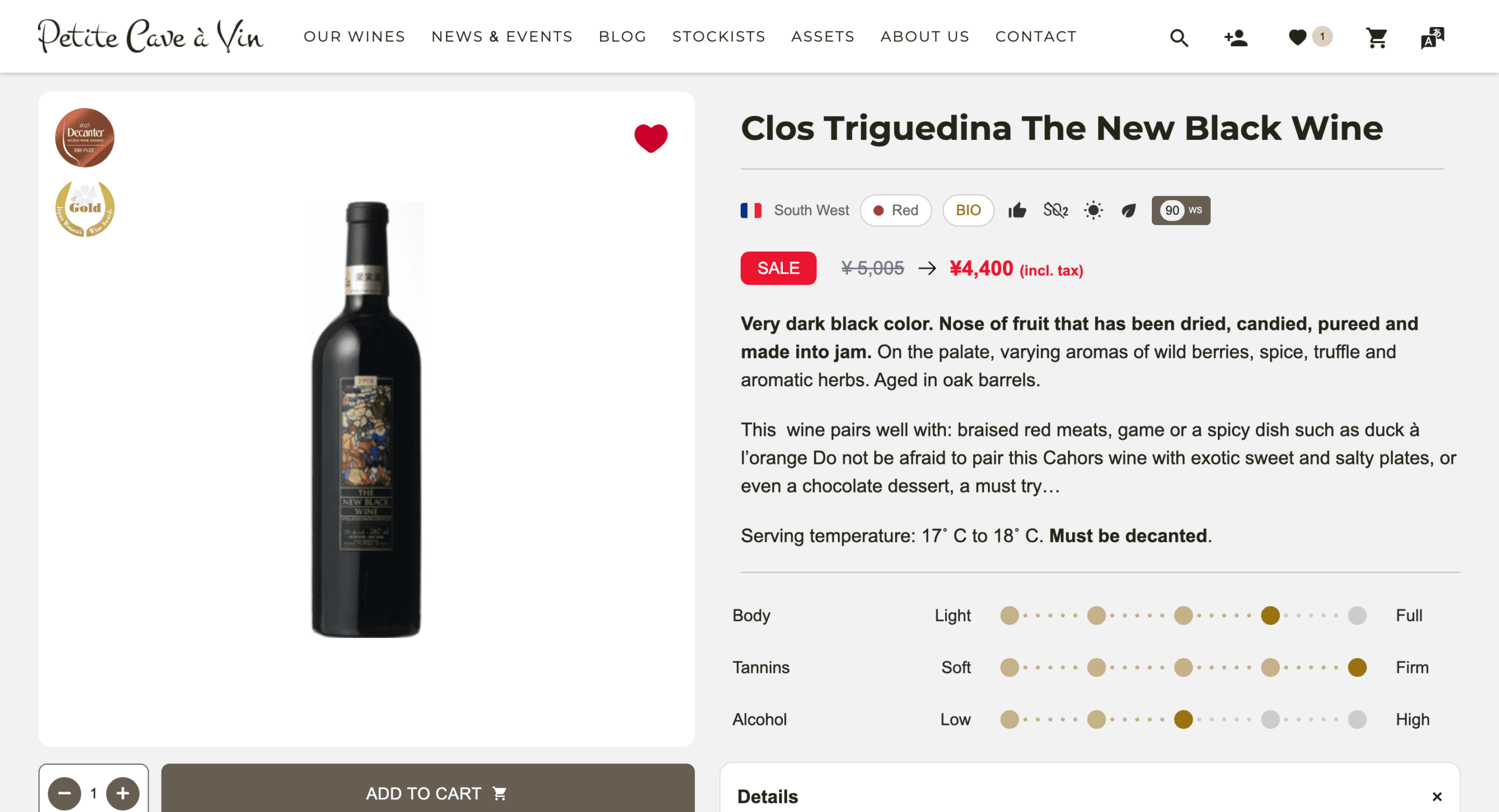
- Above the fold: bottle image, wine name, producer, vintage, price, purchase or inquiry button, and availability
- Primary content area: description, tasting notes, key technical information, and pairing or serving guidance
- Secondary content area: producer story, vineyard detail, awards, press mentions, and technical sheets
This layout works because it matches buyer intent. First, the visitor needs to identify the product and understand what action is possible. Then the page can provide richer information that supports confidence and interest.
Secondary information still matters, but it should not crowd the main buying area. A user should never have to scroll through long brand history or dense technical copy before finding the price or stock status.
At the same time, weak or incomplete content can also hurt performance. The same Salsify 2024 report found that 45% of shoppers abandon a purchase because of poor-quality product images or videos, 42% because of incomplete or poorly written product titles or descriptions, and 56% because of no or low customer ratings or negative reviews. Clarity and completeness matter as much as clean layout.
Product Presentation: Communicating Value and Character
Wine is not just a product specification. It is also a sensory experience, place and story. A good product page should communicate that without becoming vague or overly romantic.
The best descriptions are clear, specific, and easy to scan. A short tasting summary, a few product highlights, and a concise producer introduction often work better than a long paragraph. Visitors should be able to understand style and character quickly, then go deeper if they want more detail.
For example, a wine page may briefly describe the style in plain language, then support that with concise details on vineyard location, soil, elevation, or maturation. This gives the page personality while still helping the buyer make a practical decision.
Tone matters too. Overly technical language can discourage general consumers unless the audience is clearly professional. On the other hand, generic phrases such as “perfect for any occasion” add little value. The most effective copy sits in the middle, informative, confident, and concrete.
Image Guidelines for Wine Product Pages
Visual presentation has a direct effect on product confidence. For wine, imagery should help the visitor verify, evaluate, and imagine the product.
A strong image set usually includes a high-resolution bottle image on a clean background and a clear close-up of the label. These two visuals answer many common questions immediately. They confirm product identity, support premium perception, and reduce uncertainty.
Additional images can also add value, including vineyard or winery photography, lifestyle context, or alternate bottle angles where closure, packaging, or gift presentation matters. The key is relevance. Images should support the purchase decision rather than distract from it.
Useful image guidelines include:
- use high-resolution source images so label details remain readable
- keep lighting, framing, and background consistent across the catalog
- include zoom functionality on both desktop and mobile
- add alternate angles when packaging or bottle shape matters
- use contextual imagery sparingly and only when it strengthens the product story
This is not just a visual preference. In the Salsify 2024 Consumer Research report, 76% of shoppers said high-quality product images were very or extremely important in their decision to click on a product page from search results. Better imagery supports both click-through and conversion.
Displaying Price, Availability, and Purchase Options
This is the most important conversion zone on the page, so ambiguity is costly.
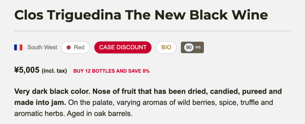
Price should be visible immediately, and the format should be easy to understand. If the site offers case pricing, mixed-case pricing, or discounts, that information should be presented clearly near the main action area. Users should not have to calculate value themselves.
Availability is equally important. In stock, limited stock, pre-order, and out-of-stock messages should be clear and consistent. Hidden or vague stock messaging creates hesitation and can increase abandonment.
Purchase options should also be simple to interpret. If buyers can order by bottle, by case, or within mixed packs, those choices should be easy to compare. Any allocation limits, minimum order requirements, or delivery restrictions should appear early enough to avoid frustration later in the journey.
Useful Functionality That Improves Conversion
Helpful features reduce friction and make the page more useful. For wine PDPs, the most effective functionality is usually practical rather than flashy.
Good examples include quantity selectors, automatic case discount logic, downloadable tech sheets, favorites or wishlists, share links, and save-for-later tools. Depending on the audience, features such as serving temperature, drinking window, and food pairing suggestions can also be useful additions.
Reviews are especially valuable. According to the PowerReviews 2023 survey, 93% of shoppers say ratings and reviews influence whether they purchase a product, and 77% actively seek out websites that include them. For wine, this social proof may come from customer feedback, critic scores, or a combination of both.
Upselling and Cross-Selling Opportunities
An effective wine PDP should not stop at a single purchase path. It should also guide the visitor toward relevant adjacent products.
This might include wines from the same producer, wines from the same region, similar styles, or comparable price points. These recommendations feel natural because they reflect how wine buyers often browse in the real world.
Placement can vary. Related wines often work well below the main product content, in a sidebar on larger screens, or after the add-to-cart action. What matters most is relevance. Recommendations should feel curated, not random.
Adapting Product Pages for B2B vs B2C Wine Buyers
Not every audience needs the same page.
B2C buyers often respond most strongly to tasting notes, food pairing ideas, producer story, and reviews. B2B buyers are more likely to look for case size, wholesale pricing, stock depth, tech sheets, and logistics information.
For wine businesses serving both groups, configurable PDP content can make a big difference. The goal is to surface the right detail for the right use case without forcing every visitor through the same experience.
Measuring Performance with GA4
Wine product pages should be reviewed as working assets, not treated as finished pages. Ongoing measurement helps identify where usability and conversion can improve.
According to Google’s GA4 ecommerce guidance, useful ecommerce events include item views, add-to-cart actions, checkout steps, purchases, and promotion interactions. For wine PDPs, that makes it possible to evaluate which pages attract interest, which products convert, and where users drop off.
Useful metrics to monitor include product page views, add-to-cart rate, conversion rate, exit rate, scroll depth, and internal search behavior. These metrics help answer practical questions, such as whether users are engaging with secondary content, whether recommendations increase basket size, or whether certain wines generate high interest but low conversion.
Conclusion: Small Improvements Can Have Big Results
Effective wine product pages combine clear information, strong visual presentation, thoughtful layout, and practical functionality. They help visitors understand the wine quickly, while also giving them enough detail to buy with confidence.
For wine websites, even small changes can make a meaningful difference. A clearer stock message, a better label image, a more useful tasting note, or a stronger recommendation block can improve both user experience and sales performance.
A good approach is to regularly review your PDPs to identify missing or weak elements, and improve them step by step. A better wine product page does not need to be complicated. It needs to be clear, credible, and easy to use.
About Wine Kiosk
Wine Kiosk is a purpose-built platform designed around exactly the kind of wine product page features discussed in this article, from flexible content management and trade login capabilities to e-commerce functionality built for the realities of wine retail. Teams that want to see how it works in practice are welcome to get in touch for a product demonstration.